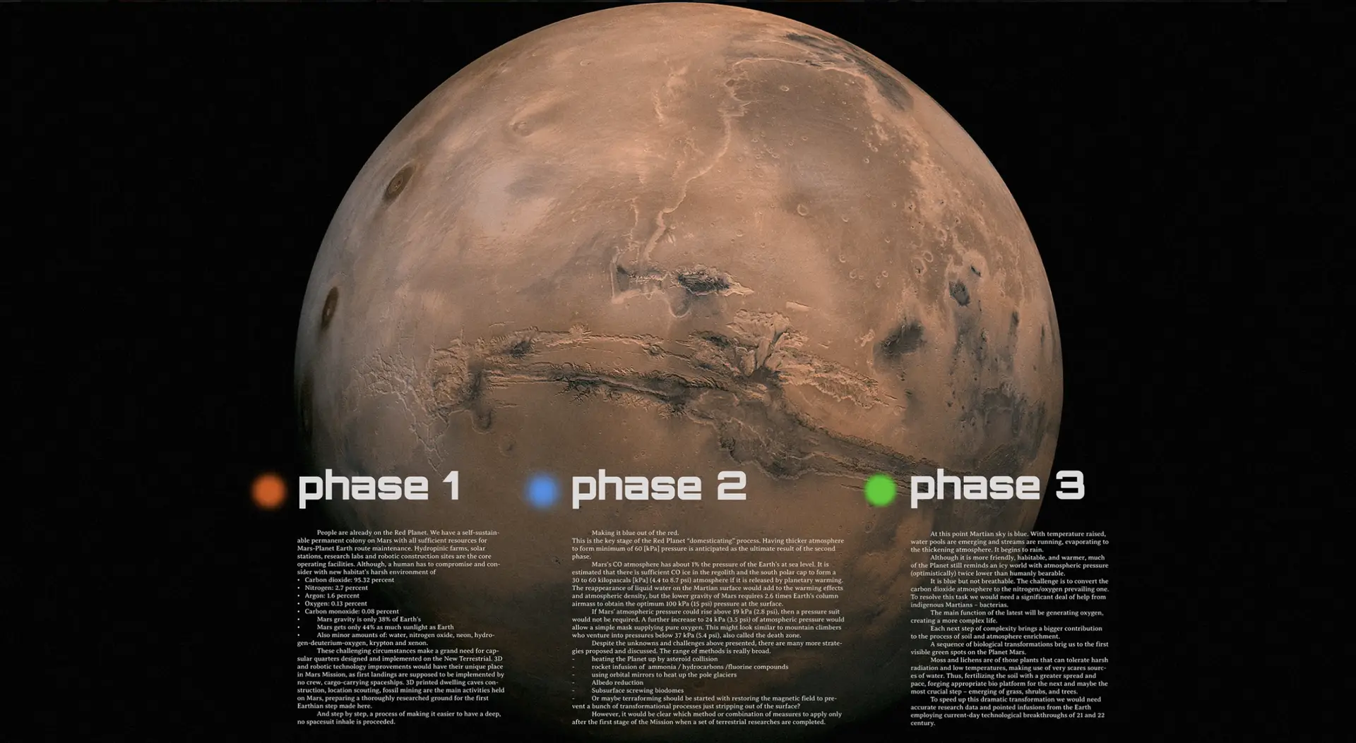
Mars Mission is a visionary project dedicated to transforming the cold and arid Red Planet into a thriving, habitable world. The journey unfolds across three strategic phases: the Red Phase (building the Earth–Mars communication network and research infrastructure), the Blue Phase (atmosphere formation and revival of primitive life), and the Green Phase (development of a breathable environment and plant ecosystems).
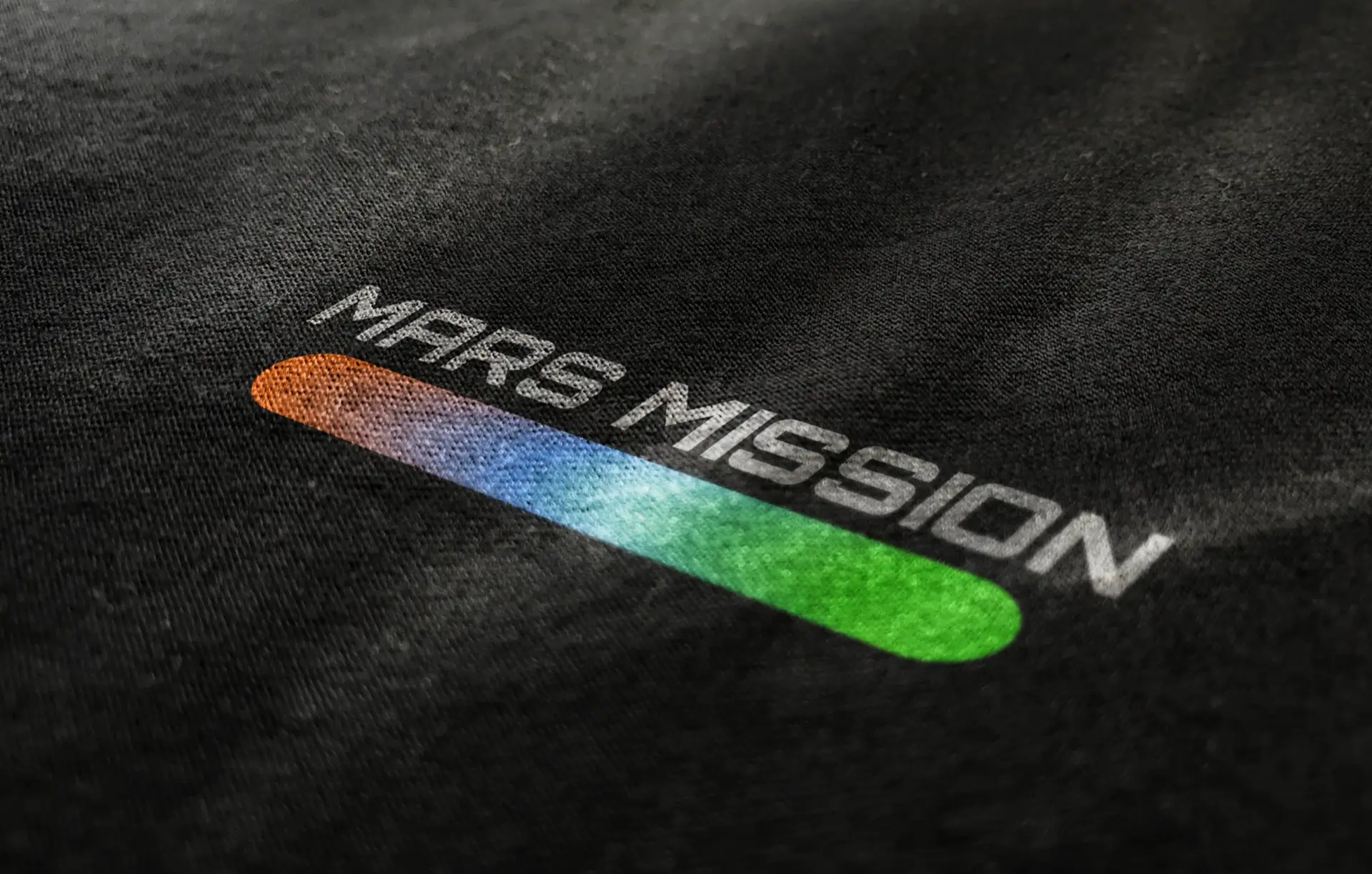
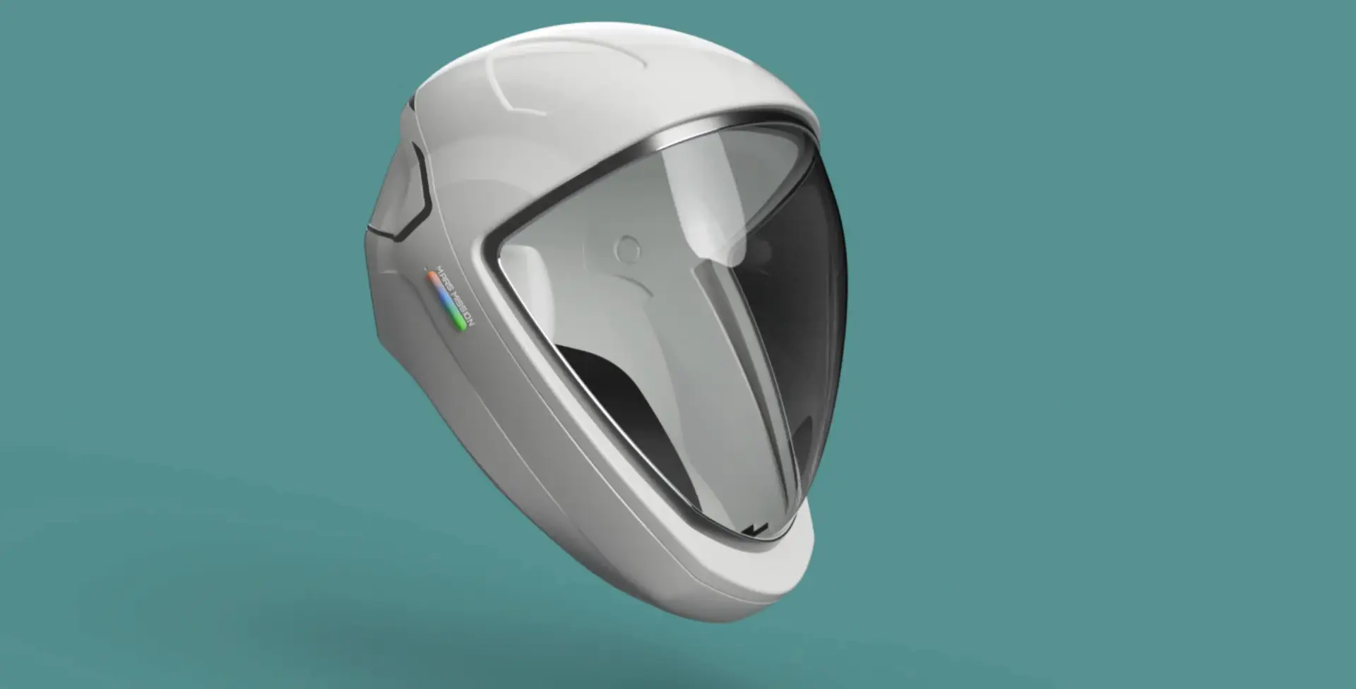
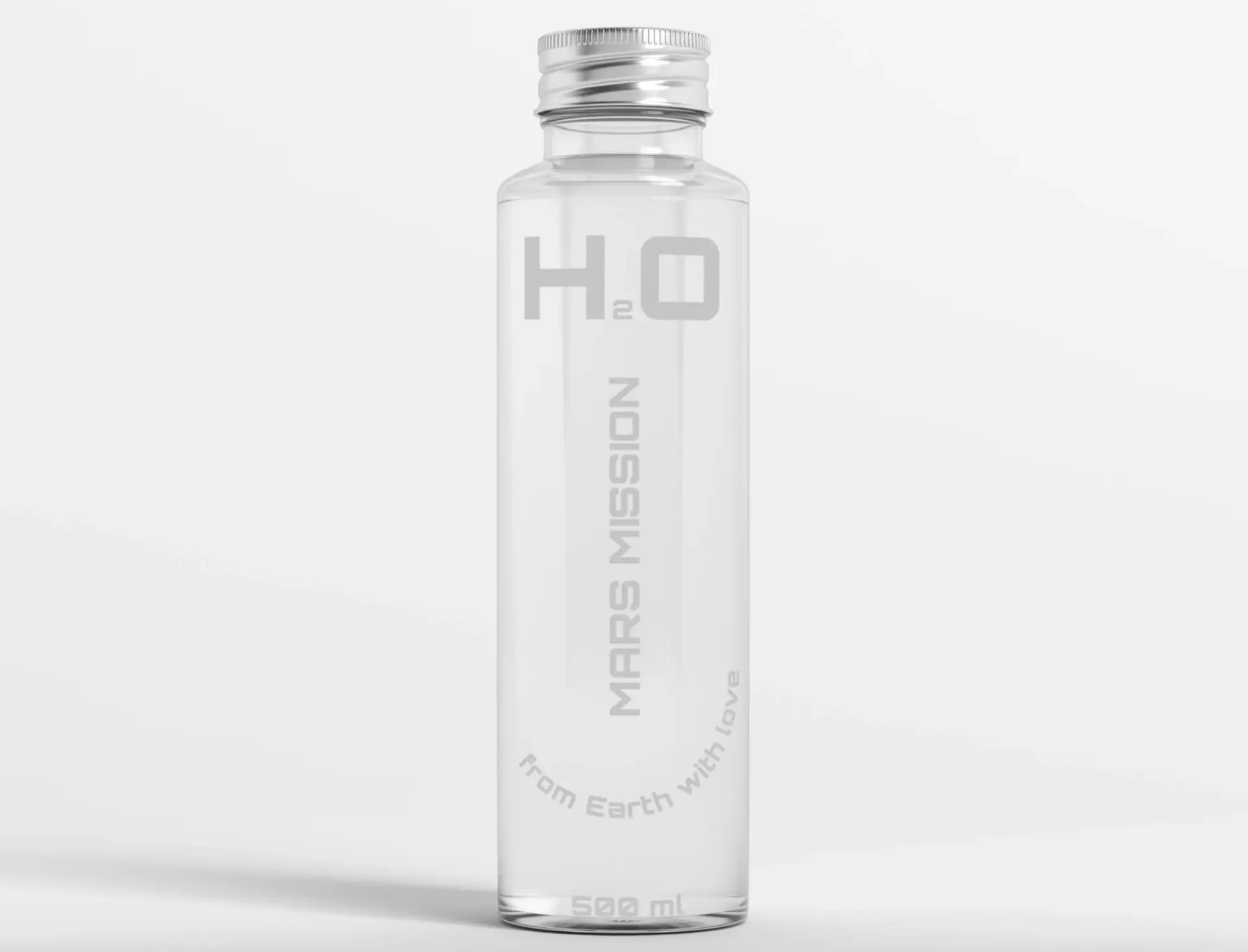
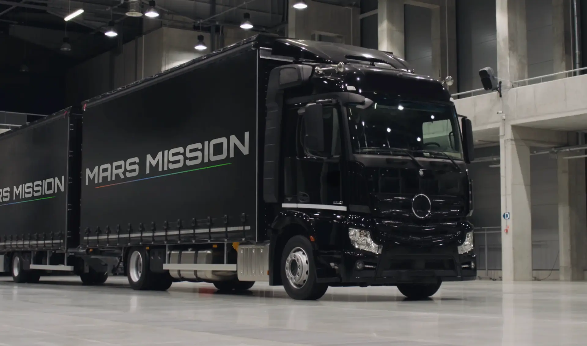
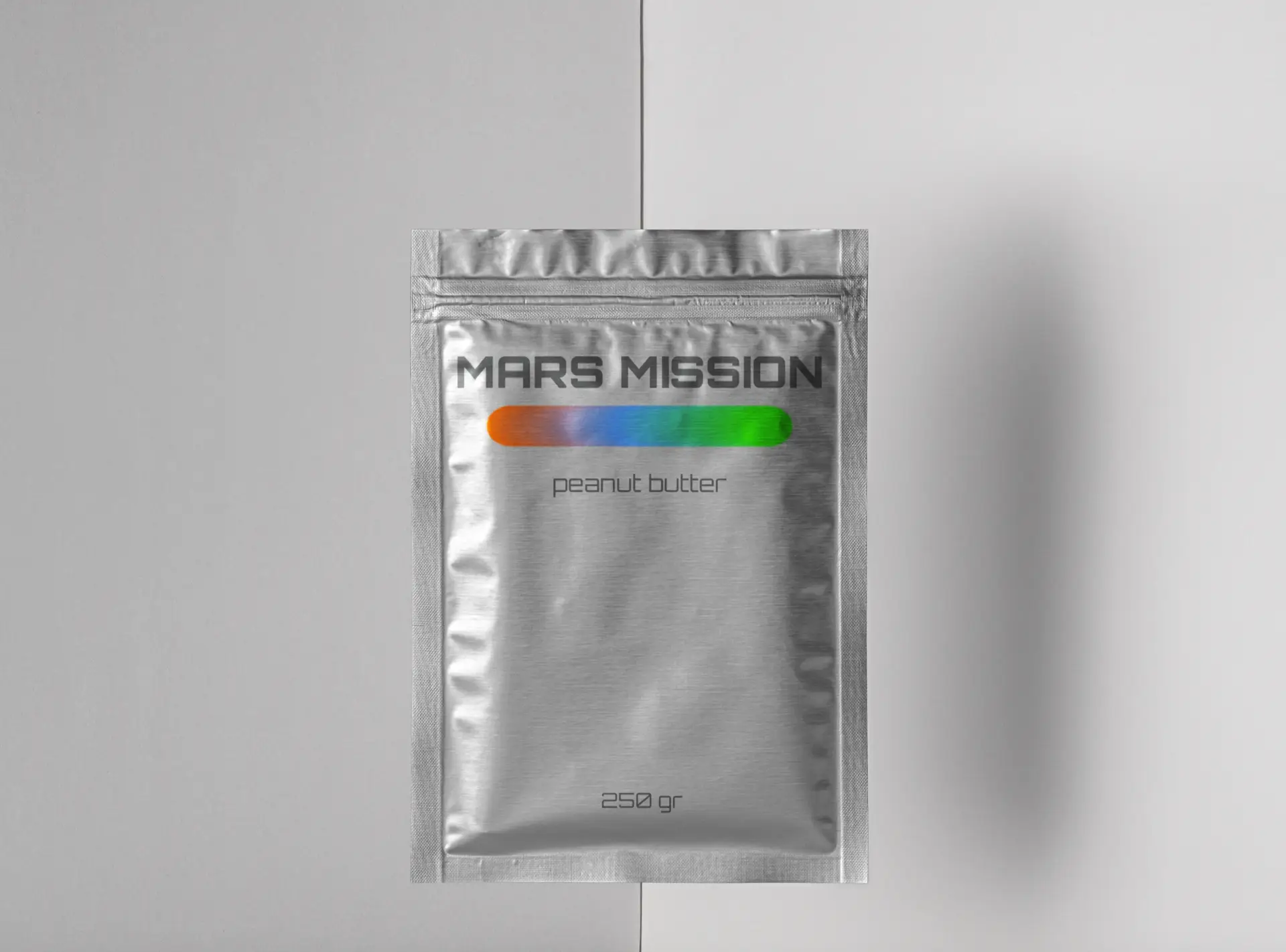
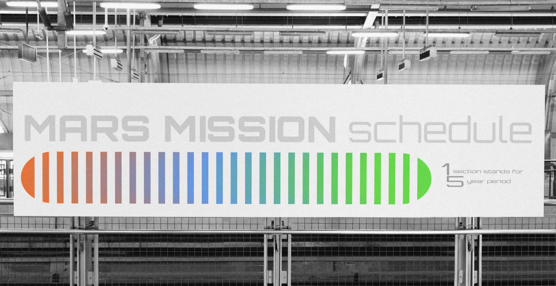
My work was to create a brand identity that could carry the scale, optimism, and clarity of this mission — a design system that communicates both scientific precision and human aspiration. The logo solution uses a clean, futuristic wordmark paired with a three-color gradient bar, visually narrating the planet’s evolution from red through blue to green. This color story is more than aesthetic, it’s a timeline, a progress bar, and a promise.
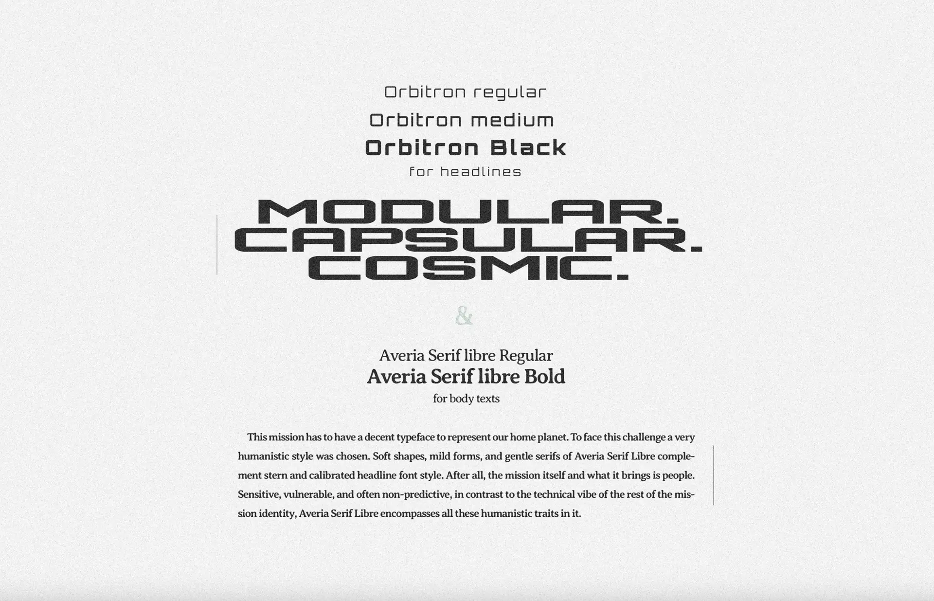
Typography choices follow the same philosophy. Orbitron, in various weights, conveys a modular, cosmic precision fit for headlines, while Averia Serif Libre adds a humanistic counterbalance for body text — soft shapes and gentle serifs reflecting the human side of exploration. Together, they create a contrast between technical mastery and the people behind it.
The visual language extends into mission schedules, planetary diagrams, and large-scale applications such as transport fleets and infrastructure banners. Every element from the phase-based planet map to the schedule graphics reinforces the project’s clarity, scalability, and narrative cohesion.